
Foundation setup
Migrated the UI layer from Angular to React/Next.js with Tailwind CSS, with linting, Sentry monitoring and CI/CD pipelines.

Building scalable foundations for design and engineering.
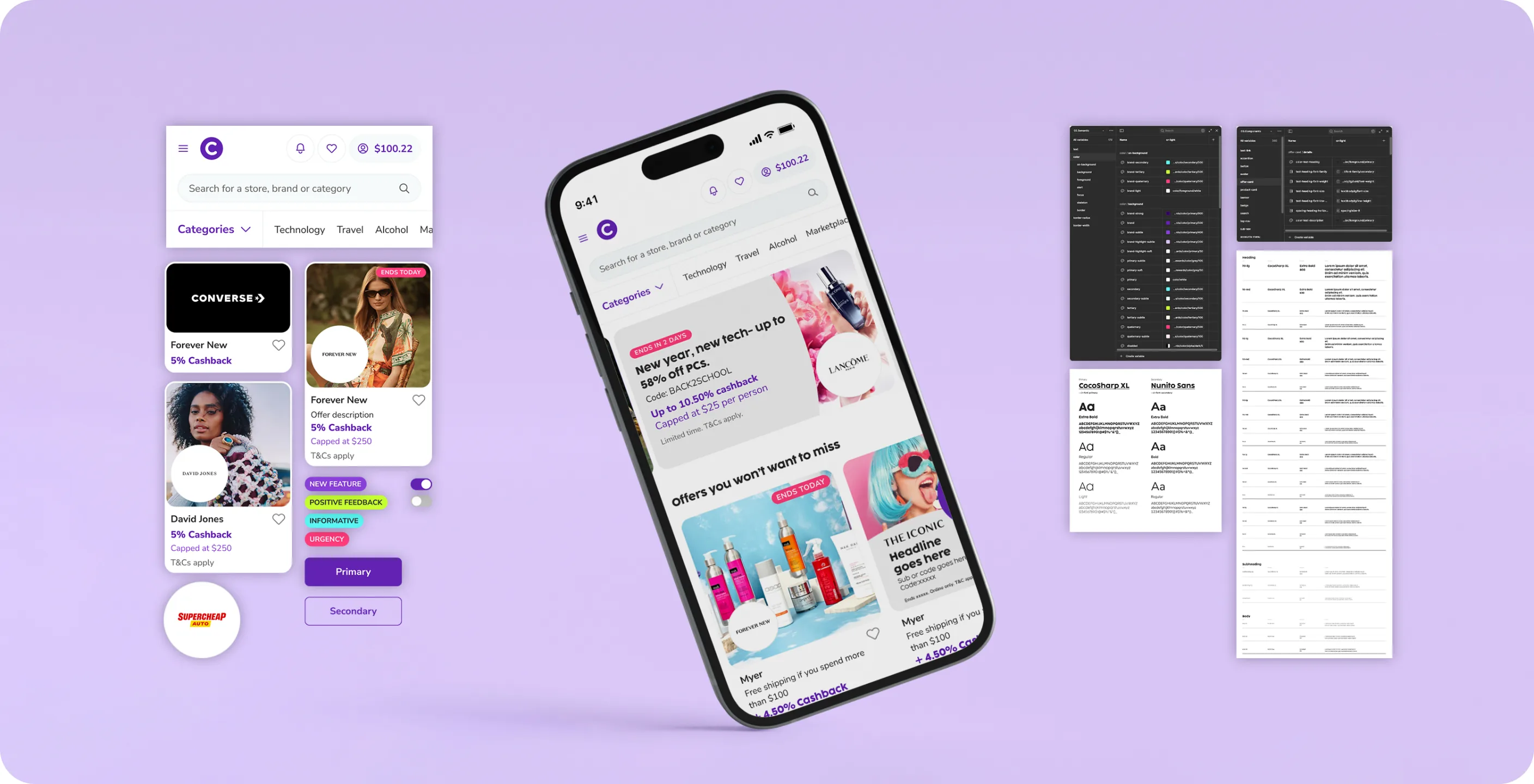
In 2022 I led the creation of the Cashrewards Design System — born from the need to modernise our front-end architecture and unify the experience across web and app. Partnering with product, brand and engineering, we moved the interface layer from Angular to React (Next.js) and built a scalable, token-based system: a structured Figma library, shared design tokens, documentation standards and a governance model.
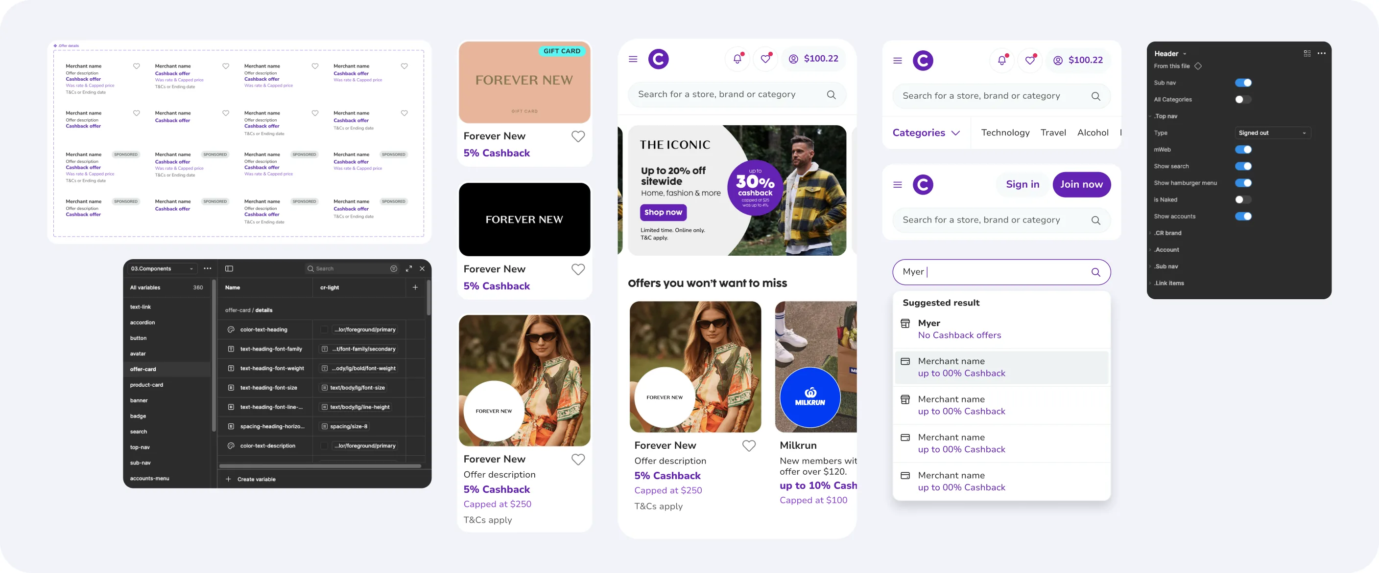
Cashrewards' digital products had grown fast, leaving fragmented styles, inconsistent components and duplicated development effort. Each squad worked fairly independently, which led to overlapping patterns, accessibility gaps and uneven user experiences.
In design, there was no single source of truth — component variants were scattered across Figma files and design tokens didn't exist. In engineering, there was no shared component library, and the Angular architecture didn't support micro-frontends or component versioning, so collaboration across squads was slow and error-prone.
We needed a shared design language and front-end system that improved quality, speed and autonomy — without sacrificing brand consistency.
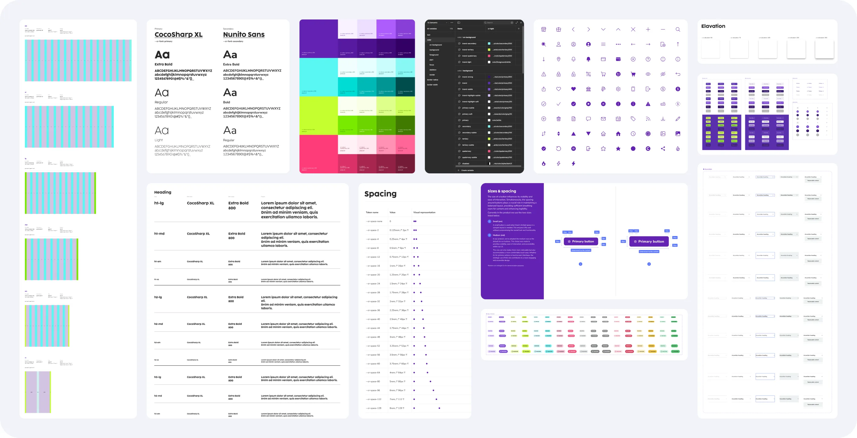
More than a visual refresh — a structural transformation that connected design and engineering through shared principles, tools and automation.
Kicked off with a cross-squad team of product, design and engineering. Set objectives, governance and the migration plan from Angular to React/Next.js, and began the component audit.
Introduced atomic design and defined core tokens for colour, typography, spacing and elevation. Aligned design, brand and engineering on naming and accessibility baselines.
Built the first Figma Design System library and aligned it with the developers' Storybook library, with shared standards and vocabulary across teams.
Front-end teams moved to React/Next.js with Tailwind CSS, plus Cypress testing, Sentry monitoring and CI/CD — laying groundwork for automatic token sync.
Engineers could pull design tokens straight from a central source of truth, with unified variable naming, granular permissions and branching.
When Cashrewards acquired Little Birdie, token-based theming let the system support both brands — and future partners and dark mode.
A governed platform embedded in the product lifecycle, shaping content standards, accessibility culture and brand consistency across teams.
A cross-disciplinary initiative built on atomic design, governance and automation.
Migrated the UI layer from Angular to React/Next.js with Tailwind CSS, with linting, Sentry monitoring and CI/CD pipelines.
Colour, typography and spacing tokens shared between design and code — paving the way for multi-brand theming and dark mode.
A full component audit, then every component rebuilt with atomic design in a dedicated library named to match engineering.
A fortnightly working group across product, design, marketing and engineering to review progress and approve changes.
Shared standards for Figma and Storybook covering how components are described, versioned and tested.
Every design component mapped to a coded equivalent — making the system an asset for both design and development.
By implementing design tokens and theming through Figma Enterprise, we enabled scalable multi-brand support and made Figma the single source of truth for both design and code.
Every component documented for accuracy, usability and consistency across the system.
Clear, unique names with annotations so designers and developers speak the same language.
Default, hover, active and disabled states with behaviour guidelines for predictable experiences.
Breakpoint specifications showing how each component adapts across screen sizes.
Every property linked to the token library — colour, type, spacing and radius — for accurate builds.
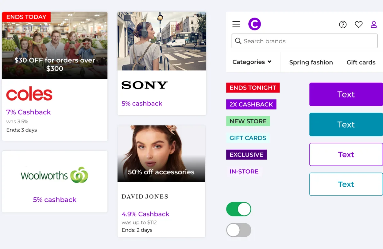
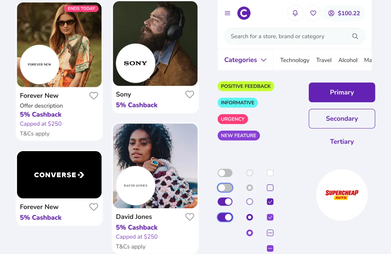
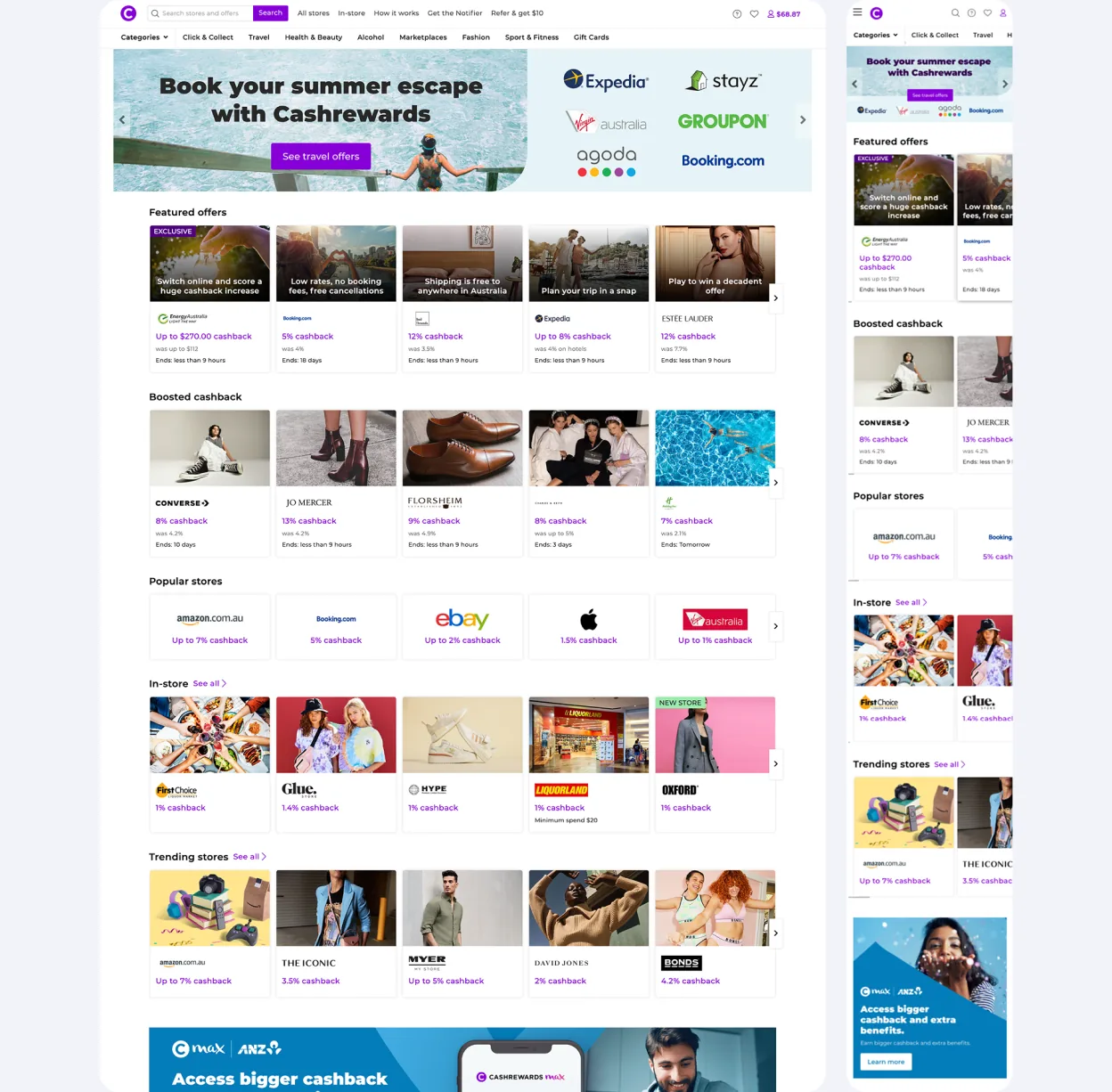
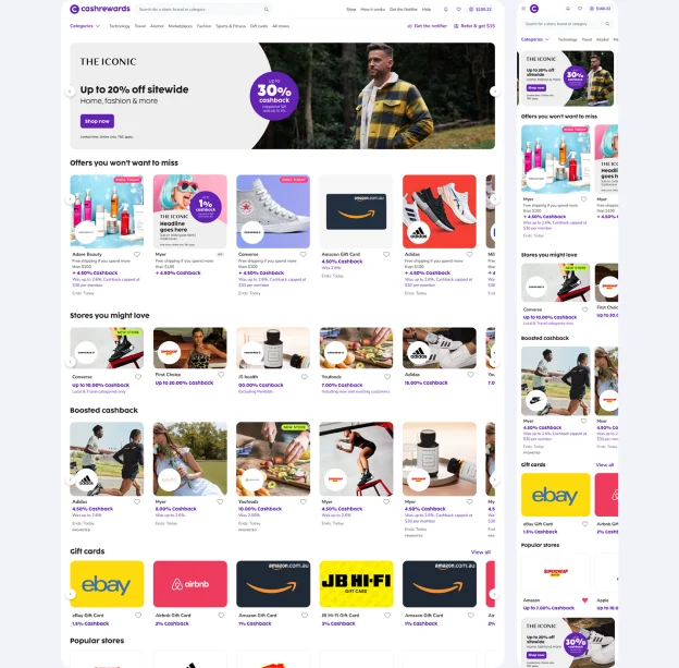
The design system changed how Cashrewards designed, built and shipped product.
Squads released features faster with reusable components, shared tokens and a unified front end.
Consolidated patterns and standardised Figma and Storybook libraries removed overhead across squads.
One source of truth for visual language and interactions, strengthening brand trust.
Token-driven theming let Cashrewards support partner and future brand variations efficiently.
Shared naming, documentation and governance reduced friction and rework between disciplines.
Accessibility and page-speed standards built into the foundations, lifting overall quality.
Reducing drop-offs by designing clarity into the journey.